

Project Description
by: Junfei Shi
For a design school student, the best thing must be choosing his/her own client and be creative about it.
I chose Tom Ford to be my first commercial design client, hypothetically.
Luxury retail stores are not like any other grocery store. It’s not only a sales point, a space to carry products, but also an expression of the company’s core value, the attitude towards this chaotic world.
In the beginning of the design process, I carefully considered the following questions before started scribbling around:
- should I follow Tom Ford’s existing store style?
Tom Ford stores have a unique sleek, masculine, hard edge style, which is so gorgeous and also the reason that I chose Tom Ford. So, I will keep that feeling, but express my own understanding in a different way—- Junfei’s design.
- What is the design concept?
Black tie.
I suppose every successful man has a black tie in his closet, just like every woman has a black dress. It is a symbol of being professional, independent, and one has a good taste. A black tie, other than any other color, is more dignified.
- How to implement “Black Tie” into my design?
One: black color; two: diagonal lines.
Black must be one of the major colors in this design, but a good balance of colors is critical. When I visualize a black tie, I see an elegant combination of diagonal lines. It’s so elegant, yet so achievable in an interior design project.
- What unique features I want to show case?
A magic touch with a series of special customized millwork
- How do I want the space to be planned?
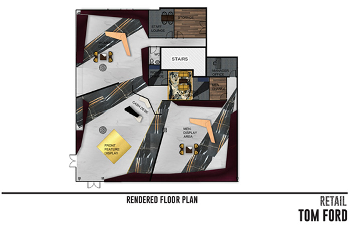
Luxurious, large circulation space; good display/ feature platform near entrance; elegant dividing between sections
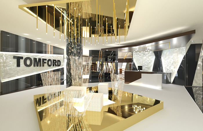
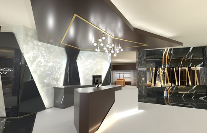
The concept “black tie” did not only appear on the vertical view (walls, shelves, etc.), it also been adopted in the flooring design. I created the floor pattern with several large scaled black ties, using black and white marble as the floor material in the merchandising space. The cash desk is designed to be a black & white bow tie, integrated with the zig zag feature wall in behind, if look from the above, the entire floor plan looks like a man’s lapel.
Material wise, I used dark warm wood for the shelves and cash area drop ceiling. This gives the store some warmth, in contrast with the black and white cold marble. Lots of brass is used to build the front door feature display area. This shiny, reflective material creates a focal point that attracts attention immediately.
I intentionally designed the shelves in diagonal angles to meet my design concept “tie”. Straight shelves are easy to make, but diagonal shelves take more effort to be made, which could be another way to express “luxury”. The final touch millwork is designed in the shape of “TF” which is Tom Ford’s logo, just to remind shoppers again: hey, you are at Tom Ford’s.
![[un]Muddy the Waters: Uncovering intertidal ecosystems in False Creek Flats](https://arcace.ca/wp-content/uploads/2021/06/unMuddy_the_Waters-500x383.jpg)