This world has been 3 dimensional since we know it. We recognize the environment visually by shape, color, size, motion, and lighting. In the past hundreds of years, artists tried hard to bring 3D world to a 2D platform: paper. That’s where we see realistic sketches, paintings, and renderings.
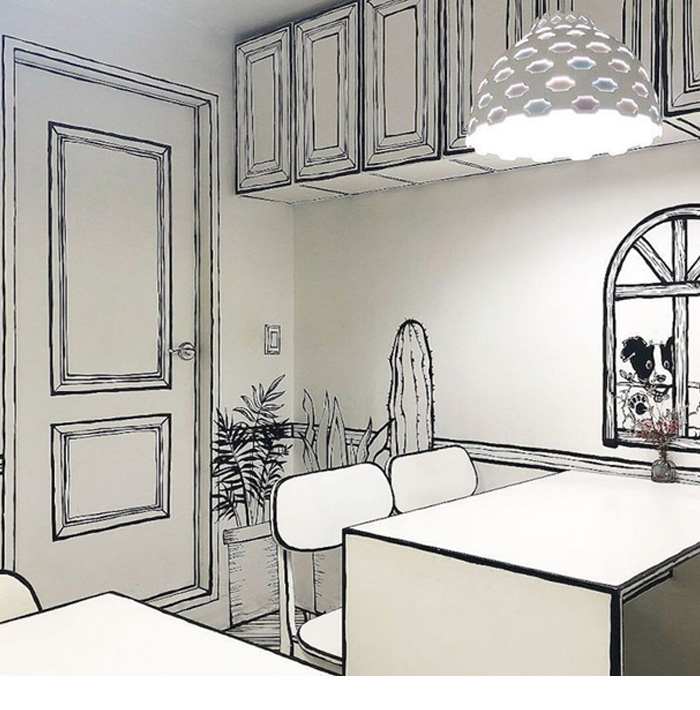
However, this café located in 223-14 Yeonnam-dong, Mapo-gu, Seoul, South Korea has done the exact opposite: down-dimensioning the 3D café space to 2D—- well, not physically, but visually.
Entering this space, you do not see any color, feel any material, nor even get a direction of where to go. All you see are strokes and white space—- like a 2D world from a manga. It looks simple, but takes a lot to achieve this unique interior style. Imagine being the interior designer of Cafe Yeonnam-dong 223-14, I would like to share my thought about this project:
- Once this concept is defined, at least one thing is off the interior designer’s mind: choosing colors. Colors could be a big headache yet a fun thing to work with. But in this project there’s no need for a color wheel to be used at any point. Cheers!
- The trick to create the manga feeling is to define where the strokes go. Each black stroke represents an edge in real life; while a white surface to be left blank in white. An old fashioned way to identify the painting on each interior item is to draw bunch of black ink sketches on paper, no shading, and then spend a lot of time figure out each stroke on the interior deco as well as furniture. However, with so many 3D modeling programs available, it’s better off just design every part on Sketchup.
- Once interior construction is done, painting must be done by professional artist. Because a wavy line on a straight edge will not create a perfect manga feeling.
- Material
Except paint, customized printed vinyl could be used as wallpaper and floor covering. White wall paint is a bit boring, let us make a brick wall, with strokes! —– Increased stroke density, added that note of changed material, totally works!
- Lighting
Lighting in a regular café not only brightens up the space, but also creates an ambiance with depth. But Cafe Yeonnam-dong 223-14 tells a different story, the feeling of depth should be limited, which eliminates the use of yellow light.
The most interesting part about this café is the contrast it created when the realistic gets involved. Say when a person is sipping coffee on the 2D table, the conflict hits the viewer directly. It is hard to tell which part is real, and how real it is. The concept itself attracts people to come close, look, touch, and feel the difference between a 3D and a 2d world.
The down-dimensioning does not depress people here, instead it brings up the interest, created a dream world that may not even exit in dreams.


