Vancouverites anticipate with excitement the unveiling of our new Landmark – the New Vancouver Art Gallery. This gallery is to represent our livable well-known city to the world in this 21st century. It is a replacement to the old one which was a successful center of peoples’ gathering, on the city scale, however, it was not seen as a good representation of the city. High expectations the Vancouverites have, to see a creative representation of the city identity through this gallery.
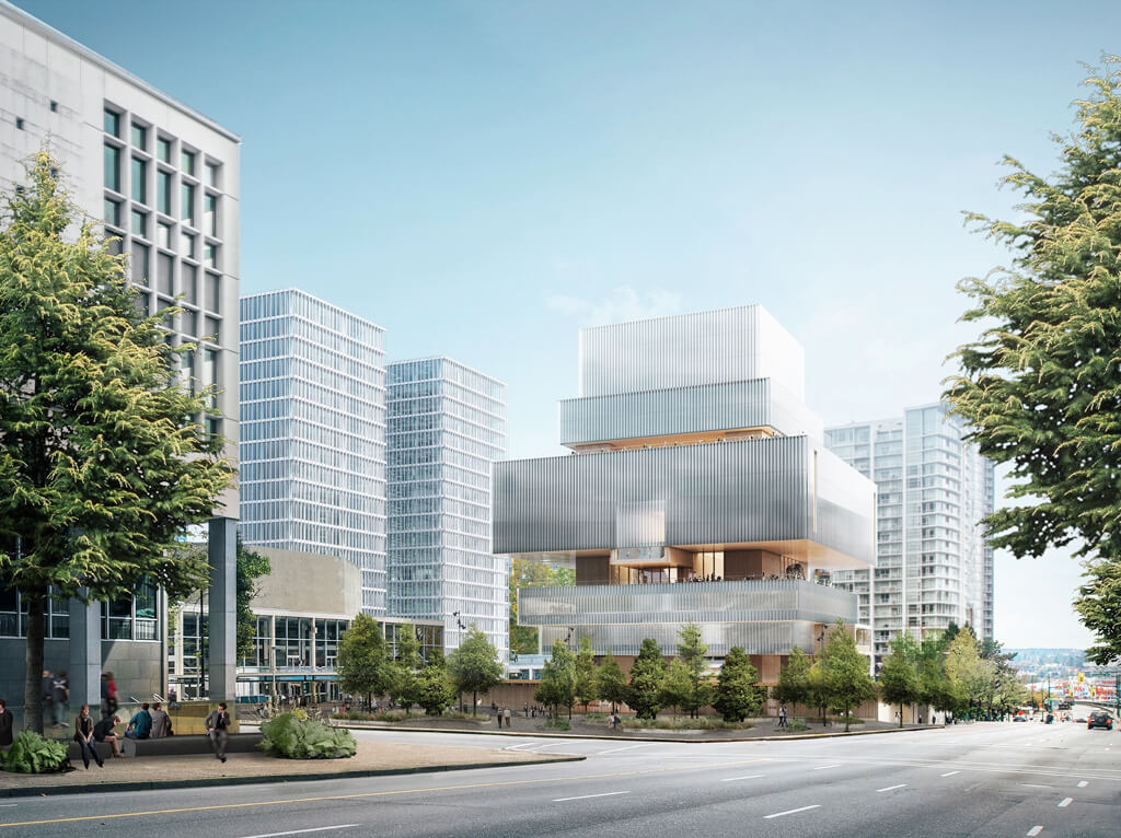
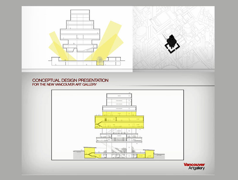
The new concept creation is driven by a rational sequence of thoughts. The building is lifted from the ground to provide an inviting gathering space on the street level. This space to be accessible from 4 directions. The building’s mass starts small sitting on one middle leg to be enlarged gradually to a maximum size in the middle floors and then gradually starts to be smaller towards the to floors. The rationale here is to allow the sunlight to come to the gathering space while blocking the rain. A lot of nice natural wood cladding is covering the building. The space program of this new building is interesting as it is made to be much more than just an art museum in a traditional sense, it will have multiple functions. The new museum will be a gallery, library, school, playground, laboratory, theatre, and community center.
Looking at the form expression and its facades may make us hesitant about accepting the form design and its impact emotionally. Art museums and their facades are expected to be an exhibition by themselves. They are usually made to tell stories about the region and the identity of the city and what do you expect to see inside. The visual vocabularies are not communicating identity in this design so far.
The building appears to us with more like a “flat” expression, without much focus on the expression aspect or the aesthetical proportion.
We hope a new design edition will be made to include these impactful dimensions.
